A few months ago, we decided it was time to give the kid’s bathroom a makeover.
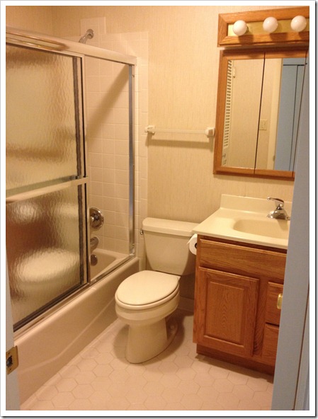
When we moved in, it looked like this.
Nice, huh? There is so much wrong with this bathroom, it’s not even funny. Basically it could use a complete overhaul, but for the time being, we just wanted to do some modest updates to give it a new, fun look without breaking the bank. The tile floors, tub, and toilet all had to stay.
Immediately upon moving in, we took off the sliding shower doors. For us, that was a no-brainer. Besides the fact that I hate cleaning those things, by removing them, it instantly opened up the space and also made it easier to bathe kids. So not only was it more appealing to the eyes, but it was also more functional for us to have them gone. Bye bye doors.
After that, the bathroom sat in it’s dismal brown state for several months while we worked on other things around the house.
When we finally got serious about the makeover, we came face to face with tearing down the wallpaper. So. not. fun. This stuff was a nightmare to get off. And there was all kinds of extra glue underneath that had to be scraped and scraped off the walls. It was miserable I tell ya. I never want to see wallpaper again.
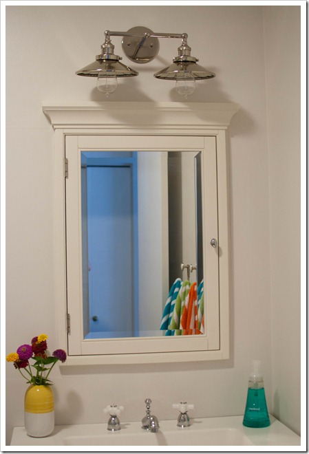
But then came the fun part of dreaming up what I wanted it to look like. Since there are no windows and absolutely no natural light in this bathroom, I wanted to make it as light, bright, and colorful as possible. I came up with this.
My father-in-law was in town at just the perfect time to help Tim remove the old vanity and install the new one. He was also the brains behind putting on the new faucet and hooking up the plumbing. I’m not sure we could have done it without him.
A peak at the faucet.
Tim did an amazing job of patching up the holes from the old medicine cabinet and light fixture and putting in the new ones. It was no easy task.
These colorful towels were the inspiration behind the new look. Since the towels are so bold and colorful I decided to paint the walls a neutral color so they wouldn’t compete with each other.
I also wanted a way to help the kids keep track of hanging up their own towel. Alphabet hooks were the perfect answer. I have warned all the kids that now I will know exactly who hasn’t hung up their towel just by glancing at the towel hooks.
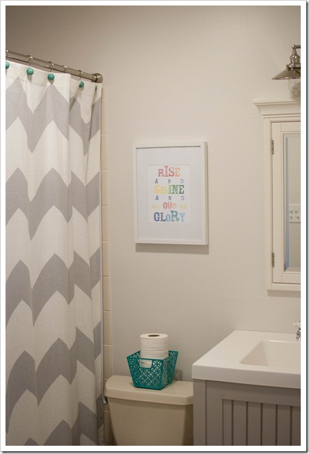
I fell in love with this print the first time I saw it and knew I wanted it in the bathroom. The rainbow of fun colors go perfectly with the towels.
One last look at the before picture
And the after:
So there ya go. From drabby and depressing to bright and happy.
Resource List
Martha Stewart Vanity – Home Depot
Hotel Recessed Medicine Cabinet – Pottery Barn
Double Sconce – Restoration Hardware
Regatta Striped Towels – Garnet Hill
Rise & Shine Print – Jones Design Company
Kingston Brass Faucet – Amazon
Alphabet Hooks – Anthropologie
Shower Curtain – Urban Outfitters


