In my last post, I gave you a sneak peek of our Master Bathroom Renovation. So today I’m back with all the details and lots of pictures.
But before we get to the After photos, it’s always fun to take a look back at the Before photos. That way you can fully appreciate the transformation.
This is how our master bathroom looked when we moved in a year and half ago.
Brown, brown, tan, cream, and more brown. So drab and dated. It felt depressing to me. We knew we would eventually renovate it, but there were other things that took a higher priority (like the kitchen). So all we really did in the beginning was remove the shower doors because they were gross and I hated cleaning them.
Then, about a year ago, Tim was on a trip and I just couldn’t take the brown anymore. So I ripped down the wallpaper, painted the walls a light blue and painted the cabinet white.
It wasn’t much, but it was definitely an improvement. It made it more livable for me.
But one of the things I really missed was being able to take baths. It’s how I relax and unwind after a long day. The kids have a bathtub, but it’s tiny and uncomfortable and always full of toys. It’s also made of cast iron, which feels cold to the touch, no matter how much hot water you put in it. They don’t seem to mind this, but I hated it because I always felt cold when I was taking a bath. So I only used it a few times before realizing it wasn’t at all relaxing or worth it for me.
Then, several months ago, we discovered the tiles in the bottom of our shower were cracking and leaking water into the basement. Tim sealed up the cracks with caulk, but this moved our bathroom renovation to the top of the to-do list. The caulk was just a temporary fix that we hoped would keep all the leaks sealed until we could make design decisions, hire professionals, and get it fully renovated.
Finally, the day came and all the ugly went out.
And over the course of a few weeks, the beautiful came in.
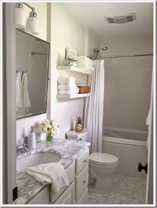
It’s such a tiny space, but we really tried to get the most out of every inch. I wanted it to feel like a spa retreat when I walked into the bathroom. As usual, I used lots of grays and whites in the space. I debated on painting the walls a “color”, but in the end, I think all the neutrals makes it feel calm and serene. Which is exactly what I need after a loud and chaotic day.
The bathtub is a four foot soaking tub by Kohler. Most tubs are five feet, but since our bathroom is so tiny, we didn’t have room for a normal size tub. Four foot tubs are hard to find. I was so thankful when Tim found this one because having a tub was such a high priority for me.
The floors are Carrara marble hexagon tiles.
We looked all over for a new vanity, but couldn’t find one that was the right size for our space and still met all of our storage needs. So we ended up just keeping our sink base and updating it. I gave it a fresh coat of paint and we replaced the top with a Carrara marble top from Home Depot. We also added drawer knobs and a new faucet.
The shelves offer extra storage space for things like towels and toilet paper.
I’m so happy with how it turned out. What once was a tiny dreary room that I hated is now a beautiful retreat for me at the end of long days.
Carrara Marble sink top – Home Depot
Carrara Marble hexagon floor tile – The Builder Depot
Shelves – Home Depot
Kohler 4 ft soaking tub – Amazon
Grohe Seabury Faucet/Showerhead/Tub spout – Amazon
Drawer Knobs – Restoration Hardware Outlet
Mirror – Restoration Hardware Outlet
Light – Pottery Barn
Towel hooks – Pottery Barn
Toilet paper holder – Pottery Barn
Toilet – American Standard Champion 4 from Home Depot
Shower curtain – Amazon
Basket – Target
Wall color – Irish Mist by Behr


Amazingly beautiful!!!!!!
ReplyDeleteI must tell you, it took my breath away!
And before I even scrolled down to read your words,
I said, " it looks like a spa!"
Wonderful job. : )
Enjoy!
Wow! From simple to fabulous. That is definitely how your bathroom turned out. I agree with you. It’s a wise move to show the before pictures first because we, the readers, we’re able to see the difference and appreciate more the transformation you made. Hope everything's going well with your bathroom, not just with the physical but the technical aspects as well.
ReplyDeleteWilson Horton @ Capital Care Plumbing