Welcome to the boys’ room.
Originally, this room was a nice neutral tan color and I hadn’t planned to paint it, but the more I thought about it, the more I had the persistent nagging feeling that it would look better white. (I’m really on a white kick right now!) And by this point, I’ve learned not to ignore my gut feelings on these things because if I do, I know I will regret it later. So even though I had just finished painting Peyton’s room twice, our kitchen before that, and our living room before that (all since January), I just bit the bullet once more and spent a day re-painting this room, because I knew it would be worth it in the end. And it was. I think the white makes everything really pop. The color is called “Decorator’s White” by Benjamin Moore.
This room came together pretty fast and easily. I stuck with the same general colors that I had used in Hudson’s baby room (red, white, and blue), so I could use a lot of the things that we already had in there, which was great. I’m not real big on major themes, but there are little touches of nautical things around the room. And Tyson is really into sharks these days, so we got them shark sheets and the shark corkboard hanging above his bed.
The main purchase for this room re-do was the bunk beds. We really wanted bunk beds in this room because of the extra space it would free up on the other side of the room for toy storage and play space. Thankfully, we found these Pottery Barn Kids bunk beds on Craigslist, so we saved a lot of money by going that route rather than buying them brand new. They are a dark blue, so the colors fit in perfectly with the rest of the room. This was one of those things where I just felt like it was a God thing to find something that I really wanted at such a great price and that fit so perfectly with what we were already working with. (We removed the ladder to keep Hudson from climbing up there and falling off. Tyson is able to use the step stool to get up and down.)
The flag bunting over the window is from Etsy. (There’s a better picture of it up top.) I’m still thinking about hanging curtains on the lower part of the window, but have not decided exactly what I want (possibly gray and white thick horizontal stripes). This giant window is kind of a frustration to me. I’m not really sure what to do with it, but I think curtains might at least help soften the look of the humongo blaring white blinds.
One of the challenges of this room was making Tyson’s top bunk a space that functioned well for him. Usually, he stays up looking at books after Hudson has fallen asleep, so two things that he needed easy access to up there were a place to keep a few books and a light source. After trying out a few ideas (a flashlight and a camping lantern) that didn’t work very well, we settled on this wall sconce that we found on sale at PBK. And the bookshelf is actually part of a pallet that I found. Tim added boards to the bottom of it and then I painted it. It was easy and free. We also put up the red cubbies above his headboard for an extra place to keep things that he doesn’t want Hudson or Peyton getting into.
A close up of the pallet book shelf.
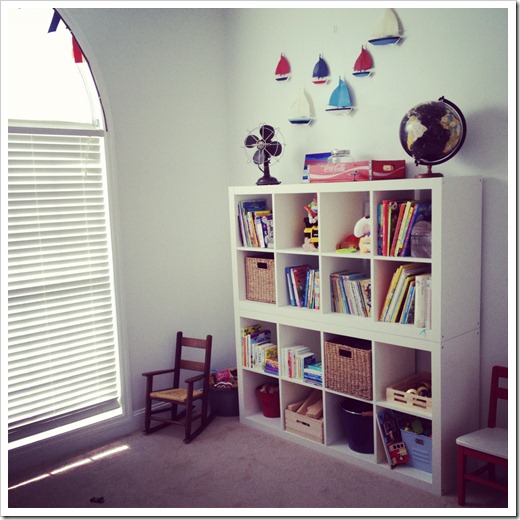
On the other side of the room, we stacked two Ikea shelves (that we already had in another room) to organize all their books, blocks, and toys. (Tim attached the shelves to each other and then wired them to the wall for safety.) I love when everything has a place to go and it looks nice too….form and function.
I used different buckets and baskets to add storage spaces for smaller toys (like Hot wheels or blocks) and to bring in colors and textures to this side of the room.
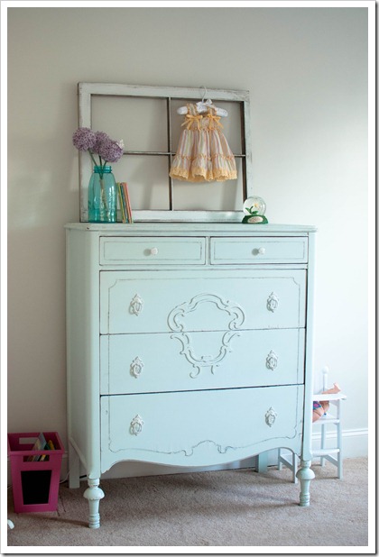
The dresser in the boy’s room was originally Tim’s dresser when he was a kid. A few years ago, we painted it white and used it for Tyson and Peyton while they were sharing a room. But over the years, the white had gotten pretty scuffed up and it wasn’t looking so great anymore. So one day in the middle of this room re-do, I just got tired of looking at it (obviously the scuff marks weren’t going to disappear on their own), so I grabbed a roller, a paint brush and some gray paint that was sitting in the garage and just started painting away. It was such a spur of the moment thing to do, but there really was nothing to lose and it turned out great.
I originally made the shelves hanging above the dresser for Hudson’s baby room a few years ago. They are a knock-off from some shelves I saw in the PBK catalog back then. I still love them and wanted to incorporate them into the boy’s room.
Well, I guess that about wraps up this room tour! Thanks for stopping by!


